Going beyond pixels and (r)ems in CSS - Relative length units based on the viewport
Going beyond pixels and (r)ems in CSS - Relative length units based on the viewport
By Brecht De Ruyte
8 min read
In this second part of the series, let’s talk about units based on the viewport also known as "the viewport-percentage length units". A lot of developers know these, but they can create some unexpected behavior, especially in combination with scrollbars and mobile behavior. Based on some articles and videos I picked up on the web from time to time, I'd like to explain some of the common pitfalls when using viewport units.

- Authors
- Name
- Brecht De Ruyte
- linkedinBrecht De Ruyte
- twitter@utilitybend
- Website
- websiteBlog
Part of series
Going beyond pixels and (r)ems in CSS
- Part 1:
Going beyond pixels and (r)ems in CSS - Relative length units based on font
- Part 2:
Going beyond pixels and (r)ems in CSS - Relative length units based on the viewport
- Part 3:
Going beyond pixels and (r)ems in CSS - Container query length units
- Part 4:
Going beyond pixels and (r)ems in CSS - Absolute length units


If you read the previous article in this series, you might’ve remembered that I’m using a list on MDN as a template to create these articles, even if it’s just for the structure. But in contrast to the list on MDN, I will take a bit of a different approach with these particular units, as I want to focus a bit more on the most common pitfalls. Once again, I will start off with the theory and basics and then move on to examples or pitfalls. Now let’s get to it.
vw
The vw unit stands for viewport width. But let’s start off with a catch right away. There are multiple things that we point at when talking about the viewport.
The layout viewport is the visible area of a web page influenced by the browser window on desktop or the device screen size (although, for devices it can depend on user zooming, keyboard opening, etc...). It determines the space available for rendering HTML content. If you positioned a fixed box around the window, that’s the viewport we’re talking about.
<div class="viewport"></div>
.viewport {
  position: fixed;
  inset: 0;
  outline: 10px dashed green;
  outline-offset: -10px;
}
The initial containing block is a rectangle in which the root (<html>) element lives. Its dimensions are tied to the layout viewport, with the top-left corner at (0,0). As the ICB is our root element, we can show it like this:
html {
  width: 100%;
  height: 100%;
  outline: 10px solid hotpink;
  outline-offset: -10px;
}
To visualize this, look at this little pen, showing the layout viewport in green and the ICB in hotpink. When we scroll the page, we can see how they behave in correlation to each other:
By giving the ICB a height of 100% we notice that the ICB follows along while the user scrolls, but the viewport will remain in place.
So why is this relevant to the vw unit?
Well, according to spec: The viewport-percentage lengths are relative to the size of the initial containing block - which is itself based on the size of either the viewport or the page area. When the height or width of the initial containing block is changed, they are scaled accordingly.
So yes, still in general, this relative length unit represents a percentage of the viewport width as the ICB is initially scaled on the viewport. For example, if the viewport width is 1000 pixels, then 1vw is equal to 10 pixels (1% of 1000 pixels). Still, it’s nice to know this little nuance.
100vw and author frustration
This is a common frustration for people writing CSS. When we position something absolute and give it a width of 100vw, we sometimes come in a situation where we have a horizontal scroll. This behavior is only visible when scroll bars are fixed and not with the overlay type of scrollbar. To enable this on macOS, go to system settings > appearance > show scroll bars and set this to always. The default is based on whether a mouse is connected or a trackpad is used.
Hot tip: I personally have this as a default, just so I can spot these kinds of issues while developing.
It is a common frustration and the easy way out is to use a width of 100%, if that isn’t an option, there are methods to calculate the width of the scroll bar, and you could calculate 100vw and subtract the scroll bar width (I have hacked my way around that before).
The reason for this is in the spec: In all cases, scrollbars are assumed not to exist. Note however that the initial containing block's size is affected by the presence of scrollbars on the viewport.
This is a basic example on where it can go wrong, be sure to toggle your scrollbar to show if you’re on macOS.
So what are vw units used for? Usually just sizing items, but they can be used as a font-size as well. Do notice that it can cause accessibility issues. One of the most interesting ways to use them for font-sizes is fluid typography when using the CSS clamp() function:
body {
  font-family: sans-serif;
  font-size: clamp(1rem, 0.8696rem + 0.6522vw, 1.375rem);
  line-height: 1.5;
}
In this example, I’m using vw as an example to create the slope, but it could be any of the units. A great starting point for fluid typography is utopia.fyi (this uses the vi unit, but we’ll get there). In some cases (for example portrait ratios), even a vh unit could make a lot of sense for fluid typography. So let's jump to that.
vh
Just as the vw unit is for width, the vh unit stands for viewport height. It is a relative unit that represents a percentage of the viewport's height. For example, if you set an element's height to 50vh, it will be half of the viewport's height. As previously mentioned, this is actually the height of the ICB, which is the size of the viewport by default.
This behavior is all fine and dandy when we’re looking at our desktop browser, but from the moment we start using this unit on our mobile browser, “stuff happens” and it’s… not pretty.
When we scroll on a mobile browser after page load we often get a particular behavior: some items start to move or collapse, such as the address bar.
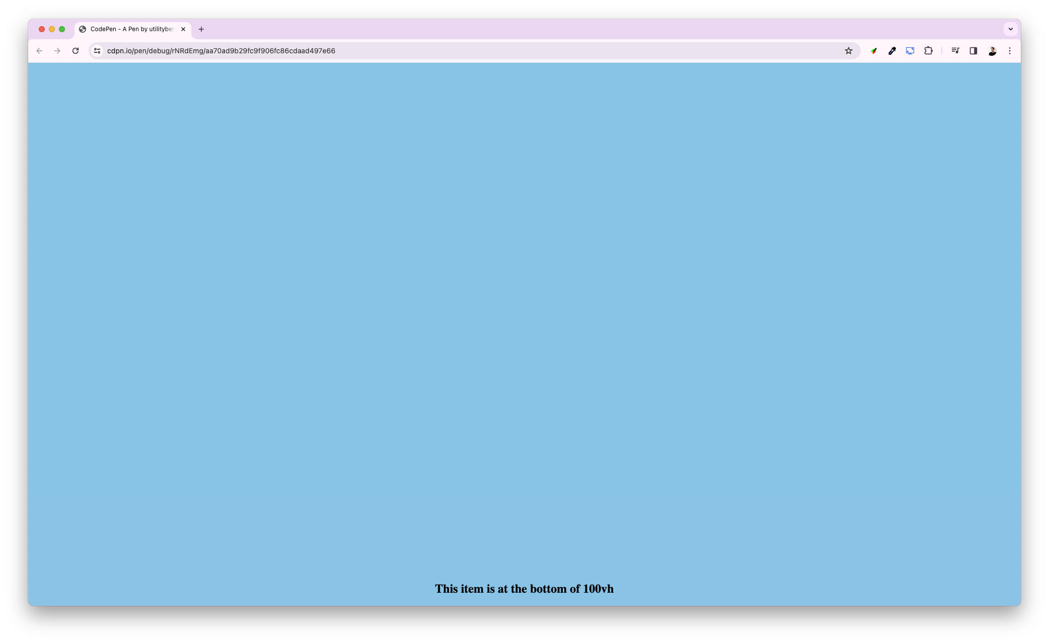
Let’s take it to the test. In our HTML, we add the following:
<div class="vh">
  <h2>This item is at the bottom of 100vh</h2>
</div>
And in our CSS we do the following:
.vh {
  display: flex;
  flex-direction: column;
  align-items: center;
  justify-content: flex-end;
  width: 100%;
  height: 100vh;
  background: skyblue;
}

body {
  margin: 0;
}
This results to the following behavior:
Desktop

Mobile Safari (iOS)

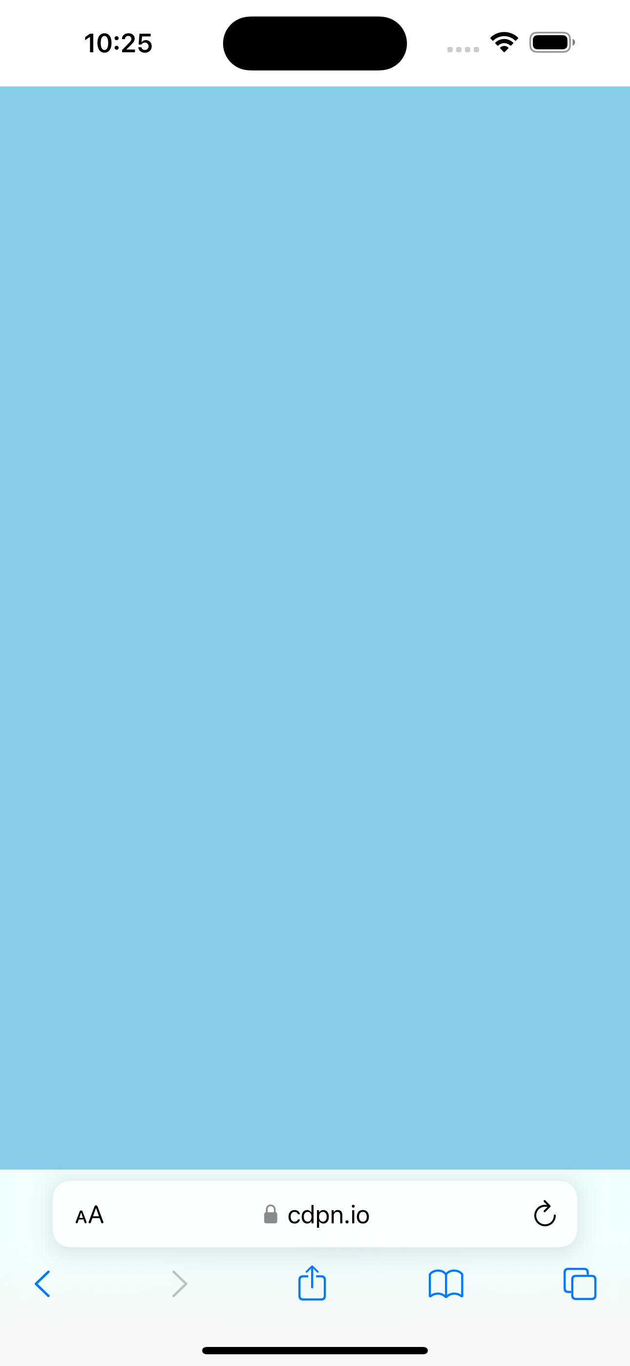
Notice, how our text is not aligned to the bottom on the mobile browser at page load. That’s because a 100vh is 100% of the viewport height when the address bar is collapsed. Which means it can result in unwanted behavior in some cases.
Luckily, there is a solution for this, but let’s get the other default units first:
vb and vi: block and inline
vi and vb, the new kids on the block (pun intended!). They are the logical counterparts to vw and vh to handle multilingual layouts flawlessly. These units will take the writing mode into account, for us in the west, the inline axis is horizontal, and the block axis is vertical. As mentioned before, utopia.fyi also uses these logical variants.
vmin and vmax
The vmin unit represents the smallest between the viewport width and height, while vmax represents the largest between the viewport width and height. This can be especially handy when switching between portrait and landscape situations.
A quick visualization (play around with your window aspect ratio and size):
A really handy example for this could be gaps in a grid. For this, I will re-use the old ch unit demo from the previous article, but now take a look at the gap property and once again play around with the window size and aspect ratio:
Large, Small and Dynamic
Let’s talk about the drug heroes for all our mobile browser frustrations. These modifiers or prefixes can be added to all of the above units in the form of l, s, or d.
l(large): Represents the viewport size, without any dynamic elements like address bars or toolbars that might be hidden or expanded.s(small): Represents the viewport size with those dynamic elements factored in.d(dynamic): Calculates the difference between the large and small viewports, offering a dynamic unit that adjusts as elements show or hide.
This is an example of svh and lvh when viewed in mobile Safari. When scrolling down, you can notice that lvh is the size of the window height plus the address bar height. The green outline is wrapped around the two elements for better visualization.

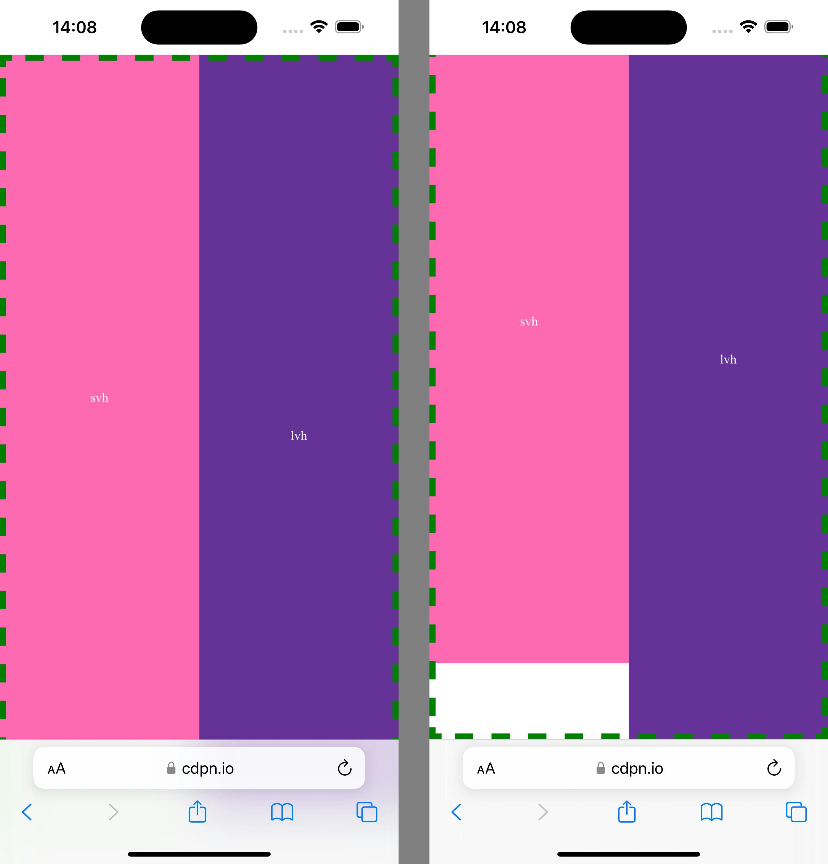
Here is a codepen link if you want to try it out on your phone
There is an excellent video
If you want to get a bit more into detail, there is an excellent video by Bramus and Jake about this and probably one of my favorite web-related videos of all time, it’s probably where I learned about the term “ICB” in the first place. Although it was released before the dynamic units were supported everywhere, it is still full of information and great examples. Always respect the source material ;) enjoy:
If you’d rather take a deep dive in the complete spec of all the level 4 units, you can always check out the spec.
That’s it for part two! In part three we’re going a bit more modern with container units. Looking forward to creating some awesome demo’s with those.
Upcoming events
Coven of Wisdom - Herentals - Winter `24 edition
Worstelen jij en je team met automated testing en performance? Kom naar onze meetup waar ervaren sprekers hun inzichten en ervaringen delen over het bouwen van robuuste en efficiënte applicaties. Schrijf je in voor een avond vol kennis, heerlijk eten en een mix van creativiteit en technologie! 🚀 18:00 – 🚪 Deuren open 18:15 – 🍕 Food & drinks 19:00 – 📢 Talk 1 20:00 – 🍹 Kleine pauze 20:15 – 📢 Talk 2 21:00 – 🙋♀️ Drinks 22:00 – 🍻 Tot de volgende keer? Tijdens deze meetup gaan we dieper in op automated testing en performance. Onze sprekers delen heel wat praktische inzichten en ervaringen. Ze vertellen je hoe je effectieve geautomatiseerde tests kunt schrijven en onderhouden, en hoe je de prestaties van je applicatie kunt optimaliseren. Houd onze updates in de gaten voor meer informatie over de sprekers en hun specifieke onderwerpen. Over iO Wij zijn iO: een groeiend team van experts die end-to-end-diensten aanbieden voor communicatie en digitale transformatie. We denken groot en werken lokaal. Aan strategie, creatie, content, marketing en technologie. In nauwe samenwerking met onze klanten om hun merken te versterken, hun digitale systemen te verbeteren en hun toekomstbestendige groei veilig te stellen. We helpen klanten niet alleen hun zakelijke doelen te bereiken. Samen verkennen en benutten we de eindeloze mogelijkheden die markten in constante verandering bieden. De springplank voor die visie is talent. Onze campus is onze broedplaats voor innovatie, die een omgeving creëert die talent de ruimte en stimulans geeft die het nodig heeft om te ontkiemen, te ontwikkelen en te floreren. Want werken aan de infinite opportunities van morgen, dat doen we vandaag.
| Coven of Wisdom Herentals
Go to page for Coven of Wisdom - Herentals - Winter `24 editionMastering Event-Driven Design
PLEASE RSVP SO THAT WE KNOW HOW MUCH FOOD WE WILL NEED Are you and your team struggling with event-driven microservices? Join us for a meetup with Mehmet Akif Tütüncü, a senior software engineer, who has given multiple great talks so far and Allard Buijze founder of CTO and founder of AxonIQ, who built the fundaments of the Axon Framework. RSVP for an evening of learning, delicious food, and the fusion of creativity and tech! 🚀 18:00 – 🚪 Doors open to the public 18:15 – 🍕 Let’s eat 19:00 – 📢 Getting Your Axe On Event Sourcing with Axon Framework 20:00 – 🍹 Small break 20:15 – 📢 Event-Driven Microservices - Beyond the Fairy Tale 21:00 – 🙋♀️ drinks 22:00 – 🍻 See you next time? Details: Getting Your Axe On - Event Sourcing with Axon Framework In this presentation, we will explore the basics of event-driven architecture using Axon Framework. We'll start by explaining key concepts such as Event Sourcing and Command Query Responsibility Segregation (CQRS), and how they can improve the scalability and maintainability of modern applications. You will learn what Axon Framework is, how it simplifies implementing these patterns, and see hands-on examples of setting up a project with Axon Framework and Spring Boot. Whether you are new to these concepts or looking to understand them more, this session will provide practical insights and tools to help you build resilient and efficient applications. Event-Driven Microservices - Beyond the Fairy Tale Our applications need to be faster, better, bigger, smarter, and more enjoyable to meet our demanding end-users needs. In recent years, the way we build, run, and operate our software has changed significantly. We use scalable platforms to deploy and manage our applications. Instead of big monolithic deployment applications, we now deploy small, functionally consistent components as microservices. Problem. Solved. Right? Unfortunately, for most of us, microservices, and especially their event-driven variants, do not deliver on the beautiful, fairy-tale-like promises that surround them.In this session, Allard will share a different take on microservices. We will see that not much has changed in how we build software, which is why so many “microservices projects” fail nowadays. What lessons can we learn from concepts like DDD, CQRS, and Event Sourcing to help manage the complexity of our systems? He will also show how message-driven communication allows us to focus on finding the boundaries of functionally cohesive components, which we can evolve into microservices should the need arise.
| Coven of Wisdom - Utrecht
Go to page for Mastering Event-Driven DesignThe Leadership Meetup
PLEASE RSVP SO THAT WE KNOW HOW MUCH FOOD WE WILL NEED What distinguishes a software developer from a software team lead? As a team leader, you are responsible for people, their performance, and motivation. Your output is the output of your team. Whether you are a front-end or back-end developer, or any other discipline that wants to grow into the role of a tech lead, RSVP for an evening of learning, delicious food, and the fusion of leadership and tech! 🚀 18:00 – 🚪 Doors open to the public 18:15 – 🍕 Let’s eat 19:00 – 📢 First round of Talks 19:45 – 🍹 Small break 20:00 – 📢 Second round of Talks 20:45 – 🙋♀️ drinks 21:00 – 🍻 See you next time? First Round of Talks: Pixel Perfect and Perfectly Insane: About That Time My Brain Just Switched Off Remy Parzinski, Design System Lead at Logius Learn from Remy how you can care for yourself because we all need to. Second Round of Talks: Becoming a LeadDev at your client; How to Fail at Large (or How to Do Slightly Better) Arno Koehler Engineering Manager @ iO What are the things that will help you become a lead engineer? Building Team Culture (Tales of trust and positivity) Michel Blankenstein Engineering Manager @ iO & Head of Technology @ Zorggenoot How do you create a culture at your company or team? RSVP now to secure your spot, and let's explore the fascinating world of design systems together!
| Coven of Wisdom - Amsterdam
Go to page for The Leadership Meetup