Going beyond pixels and (r)ems in CSS - Relative length units based on font
Going beyond pixels and (r)ems in CSS - Relative length units based on font
By Brecht De Ruyte
11 min read
There are a lot of CSS units available at the moment and we mostly still rely on pixels and (r)ems for our sizing and fonts. I say it’s time to do a little freshening up. Instead of writing a list of which units are available in CSS that you can easily find on MDN as well, I thought I’d give some examples of where they could come in handy. I will create a mini-series out of this and for the first part, let’s start off with relative length units based on font.
- Authors

- Name
- Brecht De Ruyte
Part of series
Going beyond pixels and (r)ems in CSS
- Part 1:
Going beyond pixels and (r)ems in CSS - Relative length units based on font
- Part 2:
Going beyond pixels and (r)ems in CSS - Relative length units based on the viewport
- Part 3:
Going beyond pixels and (r)ems in CSS - Container query length units
- Part 4:
Going beyond pixels and (r)ems in CSS - Absolute length units
I will base this article on a list found at MDN as a reference but will add some extra upcoming things in the mix later on. The idea is that this is more than just an MDN copy and yes, there are a few units out there that I didn’t try out before writing this article. So take this little journey with me in the wonderful world of <length> units in CSS.
For each of these units, I will add the basic theory first and then double down with some ideas on how to use them. I know there are probably many more ideas on how you would use them so feel free to share those as a response to this article so that people can get inspired by your examples. In these demos I do want to keep the eye candy to the minimum and keep it practical. Now let’s dive in!
cap
The cap unit measures the distance from the baseline to the top of capital or uppercase letters. It is typically used in conjunction with other font-relative units.
This unit is useful for creating layouts that are scale-independent and responsive to different fonts and font sizes. For instance, you can use the cap unit to set the height of headings and other elements, ensuring that they maintain their visual proportions regardless of the font choice.
A perfect example that comes to mind is to align an icon or square with a title and give it exactly the same height as a capital:
Notice how I did not use any positioning on the icon, this is just following along nicely with the font. Just as the all-known (r)em values this unit can enhance the accessibility and usability of your web designs. It helps you to keep the layout scale-independent, ensuring that your users can interact with your content effectively regardless of their preferred font settings or device screen size. The same goes for all the following units on this list.
ch
The ch unit represents the advanced measure of the character 0 (zero) in the font used to render it. It is an absolute length unit, though it scales with the font-size of the current element.
The ch unit was mostly used for sizing elements in monospace fonts, where all characters have the same width. This is because the advance measure of the character 0 is consistent for all monospace fonts. But even without using it with a monospace font, we can create some lovely responsive behavior with it. A fun thing to note though is that this works in multiple writing modes: when the inline axis is vertical on a webpage, the calculation is based on the height of the zero glyph.
How about a one-liner responsive grid? This little article says that the ideal reading length is between 50-60 characters and I've read some other studies before which gave it an average of about 45-75 characters. How about we play with that idea for a grid?
Let’s say we want a grid where items are only next to each other if they can at least fit 45 characters in one line. We could do this with CSS Grid and the ch unit
.grid {
  --grid-min: 45ch;
  --grid-gap: 2vmax;
  display: grid;
  grid-template-columns: repeat(auto-fit, minmax(min(var(--grid-min), 100%), 1fr));
  gap: var(--grid-gap);
}
Recently, Davy De Pauw from campus Ghent showed me an alternative method by even combining clamp() function inside of the grid-template-columns. It might become a bit heavy on the eyes, but it does show you just how powerful this ch unit can be in combination with grids. But do note that browsers can have a hard time calculating the grids depending on the math:
So in general if you want some width based on the approximate amount of characters inside of it, this is the unit for you.
If you want to learn a bit more about that grid technique in general, I created an article on that a little while ago in combination with subgrid: Grid ideas: Creating a CSS subgrid utility class for rows
em
The em unit - known by many - represents the current font size of the element it is applied to. It is a very versatile unit that can be used to define margins, paddings, font sizes, and other properties of an element relative to its parent element's font-size. It’s a very versatile unit that is easy to understand but can be hard to master.
I know many people who are strong in using the em unit (and I applaud them!), but I've always found the relative size based on the parent a hard thing to master. Unless you are designing straight inside the browser and you don’t have a pixel-perfect designer looking over your shoulder… ;) Joking aside, I do believe it is an important unit to get the hang of even though I might need some practice myself.
To show a special use case of this example, I thought the usage of media queries could be interesting.
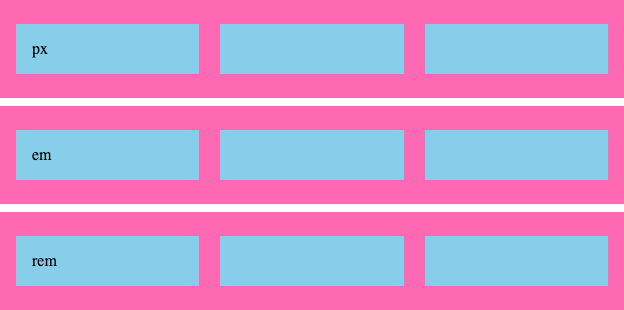
Imagine the following scenario: We have 3 <div> elements inside of the HTML, each containing three children, we give those wrappers a class based on the media query unit we’re going to trigger:
<div class="px">
  <div class="item"></div>
  <div class="item"></div>
  <div class="item"></div>
</div>
<div class="em">
  <!-- three item divs -->
</div>
<div class="rem">
  <!-- three item divs -->
</div>
Some basic styling aside, The items should switch to a three-column layout at a certain point. Important to note is that we haven’t changed the default font-size of 1rem (16px by default).
These are our media queries:
@media (min-width: 640px) {
  .px {
    display: grid;
    grid-template-columns: repeat(3, 1fr);
    gap: 2vmax;
    background-color: hotpink;
  }
}

@media (min-width: 40em) {
  .em {
    /* Same as we did for px */
  }
}

@media (min-width: 40rem) {
  .rem {
    /* Same as we did for px */
  }
}
Now we both have an equivalent of 640px in the (r)em values (16x40 = 640) and by no surprise, with the basic font size in your browser, all of these will trigger at the same time:
But now let’s change the default font-size of the browser. In Chrome, go to settings > appearance > Customize fonts and change the default font size to about 30 (note: zooming in the browser won’t work, this is a different behavior).
Now if we size our screen to 640px, the following will occur:
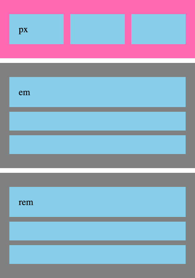
And when about 1200px (or 40em in this environment) we will get the following:
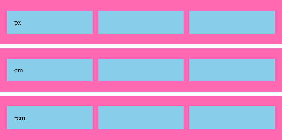
So the question: Is using (r)em values for media queries better for accessibility and user preferences? The answer - as always - it depends. This is hardly the article to do an in-depth discussion about that because it can easily become opinionated. Here is that demo if you want to try it out, don’t forget to play around with your default font-size for the full effect:
ex
The ex unit might sound like Xzibit’s has founded some new background vocal group but we’re still talking about CSS here. This unit represents the x-height of the font used to render it. The x-height is the height of lowercase letters like "x" and is typically about half the height of the tallest letter in the font.
Yes, we’re getting into some serious typography territory here, but bear with me, it has some really practical use cases. Some great usages could be:
- Set the line height of paragraphs to 1.2 times the x-height
- Set the padding and margins of elements to multiples of the x-height
- Create a baseline grid to align elements vertically
Let’s start by revisiting the cap demo from before. Maybe we want our icon to be the size of the x-height of the font, which can be aesthetically pleasing as well:
Or how about this cool effect where we create visual borders that are just the x-height of the font:
It might not be something we can use every day but it sure is nice to have these kinds of units. I’m pretty sure that big typography enthusiasts can get a lot out of this unit by creating some smart systems that orchestrate that perfect vertical rhythm. I’ll wisely leave that challenge to some of the readers here. ;)
ic
A unit that we probably won’t need in the Western part of the world, it measures the width of a full-width character in the font used to render it. It is specifically designed for sizing elements in Chinese, Japanese, and Korean, where characters can have different widths depending on their complexity. It is based on the "水" glyph (water ideograph) because this character is the same across those languages.
I couldn’t really create a demo of this to give it enough credit. But I did find this demo by sitepoint:
lh
Equal to the computed value of the line-height property of the element on which it is used, converted to an absolute length.
This can help us to achieve some great layout effects with our typography.
I got inspired by an lh demo at MDN, gave my take on it, and further enhanced it to show the power of this unit. Take a look at the following example:
Another great idea for this unit could be to size the padding of a box based on the line-height. Here is a little example of that, but be sure to play around with the --padding custom property to get a feel for the effect:
rem and rlh
Most of us have used the rem unit before, it is short for "root em" and measures the font size of an element relative to the font size of the root element. The root element, typically represented by the <html> element, has a default font size of 16px in most browsers. Therefore, 1rem is equivalent to 16px if not changed by a reset.
Some front-end developers swear by using rems as a value for media queries.
@media (width <= 32rem) {
  h1 {
    font-size: 2rem;
  }
}
This takes some getting used to and still is the better metric for users that change their default font sizes. There are a few articles to be found on this subject “pixels vs (r)em for media queries”, but most of them are a bit too opinionated for my taste to add to this article.
Speaking of root-based units, we also have rlh, which is then based on the root line-height.
New root units: rex, rch, ric
The root elements for ex, ch, and ic are now supported in most browsers, we’re still waiting a bit for Firefox at the time I’m writing this. Check out rch support here.
So that’s it for our relative length units on fonts! I hope you do try some of these in your next project, even if it’s just for a little alert on a page. It’s these small steps in including them that can make them a good habit in the future. I had fun playing around with them while creating this article and I hope you will as well.
Keep on crunching those units ya’ll 🤙 See you on the tech_hub for the next part of “Going beyond pixels and (r)ems in CSS”