Going beyond pixels and (r)ems in CSS - Container query length units
Going beyond pixels and (r)ems in CSS - Container query length units
By Brecht De Ruyte
9 min read
In the third part of this series, we’ll look at length units based on the container. Yes, you heard that right, we can finally get some measurements based on a containing element and that just spells awesome in my book. Currently available in all evergreen browsers, these units open up a lot of opportunities to create some smart systems and once again, I will write this up packed with a bunch of demos and cool use cases.

- Authors

- Name
- Brecht De Ruyte
Part of series
Going beyond pixels and (r)ems in CSS
- Part 1:
Going beyond pixels and (r)ems in CSS - Relative length units based on font
- Part 2:
Going beyond pixels and (r)ems in CSS - Relative length units based on the viewport
- Part 3:
Going beyond pixels and (r)ems in CSS - Container query length units
- Part 4:
Going beyond pixels and (r)ems in CSS - Absolute length units
As part of the containment spec, container queries are something to be reckoned with and in my personal opinion, they still aren’t used enough, but that’s a whole other discussion. What we’ll be covering today are the units that came with this awesome spec and once again, this article will be based on the list at MDN. First, we’ll get through the basics with a listing of the units, followed up with some more advanced usage.
Prerequisites for using container query length units
Before we get started we will need to define a container-type for the container we’ll target. For our first example, let’s add a bit of HTML:
<div class="container">
  <div class="item">A cool container item</div>
</div>
Next up, let’s write a bit of CSS to define a container-type on our container and give it a max-width:
.container {
  container-type: inline-size;
  max-width: 800px;
}
This is the part that matters, but let’s add some presentational styling as well, to visualize what is going on:
.container {
  container-type: inline-size;
  max-width: 800px;
  width: 100%;
  text-align: center;
  border: 2px dotted #695958;
}

.item {
  background: #271f30;
  color: white;
}
Ok, we’ve set our container-type and added some basic styling, It’s time to dig in and get started with those units:
cqw
The cqw unit stands for 1% of the containing element's width. It allows you to define element sizes and spacing relative to the width of their container in contrast to the vw unit, which defines the spacing relative to the viewport. But just as viewport and font units, it can be used in any property that accepts <length> values, such as font-size, width, padding, margin, etc. The latter counts for every unit we will tackle in this article.
Now, a demo says more than a thousand words, so let’s put it to the test. Let’s add a margin to our previous code for the .item inside of the container:
.item {
  /*previous code */
  margin: 5cqw;
}
Now the item will have a margin based on its container. This is what you should have now, resize the container to see this in full effect:
Now let’s make the effect stick out a bit more by making some other properties rely on the cqw unit.
.item {
  margin: 6cqw;
  padding: 1cqw;
  font-size: 5cqw;
}
Now we can see the effect on roids. If you add a few extra containers with different max-widths, it becomes a great little demo. Just resize the following and see the potential:
Note: What happens if we don’t define a container-type on any of the parents?
In that case, the container query unit will fall back to the viewport unit equivalent, in this case: vw.
cqh
The cqh unit stands for (yes, you guessed it) 1% of the containing element's height. It allows you to define element sizes and spacing relative to the height of their container We pretty much know what’s going on here by now, so let’s get to it. One thing we could do is create a quick test out of that previous demo and change our .item CSS to use the cqh unit:
.item {
  margin: 10cqh;
  padding: 10cqh;
  height: 80cqh;
  font-size: 12cqh;
}
Now this didn’t do that much, we’ll need to change our container-type as well to use the block axis as well, so for now, change it like this:
.container {
  container-type: size;
}
And instead of our width, we’ll change the containers to have different heights:
.container {
  height: 100px;
}

.container-2 {
  height: 200px;
}

.container-3 {
  height: 100px;
}
Now you can notice that the height of the container is taken into account.
We could do some practical examples, but I’d rather show them after the next part because the next two units are probably the most important ones.
Going logical: use cqi and cqb
I believe that it’s always a good reflex to use logical variants by default. I use these a lot, but mostly for RTL writing modes, which doesn’t apply to this difference, but you never know what the future brings, so it’s good to make this a habit.
- The
cqiunit stands for 1% of the containing element’s inline axis, for western languages this is horizontal as our reading direction is from left to right. - The
cqbunit stands for 1% of the containing element’s block axis, for western languages this is vertical, but for example Mongolian, this is horizontal as their reading direction is from top to bottom.
Let’s create a practical example of the cqi unit by having a banner move from the main content to the sidebar and adjust sizes based on that.
The idea is the following, we create a 2-column grid where the children both have a container-type.
<div class="grid">
  <main></main>
  <aside></aside>
</div>
.grid {
  display: grid;
  grid-template-columns: 2fr 1fr;
  > * {
    container-type: inline-size;
  }
}
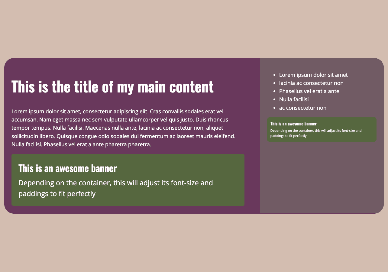
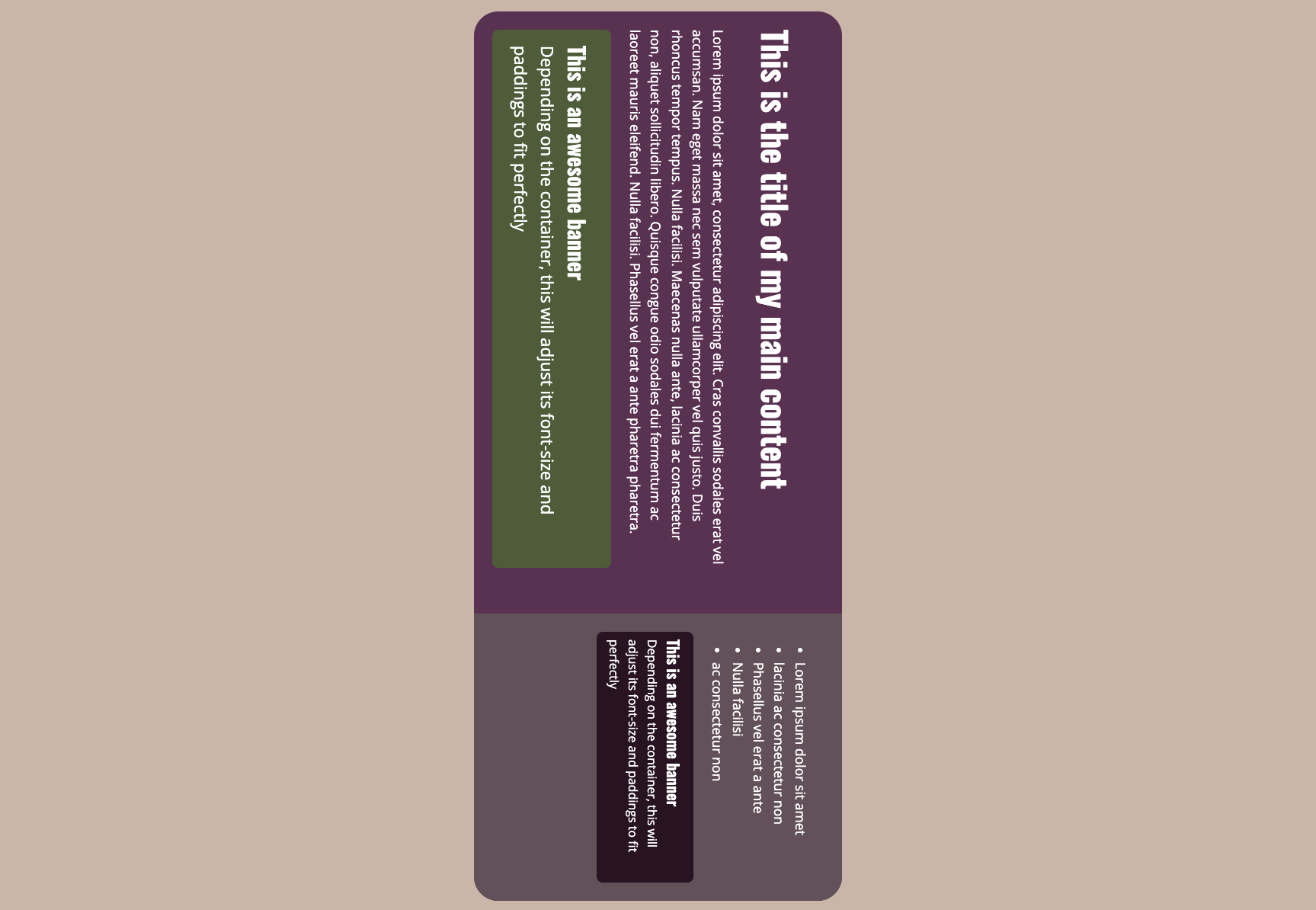
Next up, let’s create a little banner and put this in our main content
<div class="grid">
  <main>
    <div class="banner">
      <h2>This is an awesome banner</h2>
      <p>
        Depending on the container, this will adjust its font-size and paddings to fit perfectly
      </p>
    </div>
  </main>
  <aside></aside>
</div>
Let’s style our banner by using some container cqi units, as we want to work with the inline axis:
.banner {
  padding: 3cqi;
  background: #55673e;
  font-size: 3cqi;
  border-radius: 0.5rem;
}

.banner h2 {
  font-size: 4cqi;
  margin: 0 0 1cqi;
}
With this basic setup, let's move (or duplicate) that banner to the sidebar. By using these smart units and some basic styling, we get the following:
This is the CodePen of that example with some extras:
Now, while all of this looks fine and dandy when it comes to paddings, our font-size does get a bit too low in the sidebar. We can adjust this by setting a minimum and maximum font-size. Yes, we’ll be adding some fluid typography with container query units. Let’s take our previous font-size values for the banner and update them by using the clamp() function:
.banner {
  font-size: clamp(1rem, 2cqi + 0.5rem, 1.5rem);
}

.banner h2 {
  font-size: clamp(1.3rem, 3cqi + 0.5rem, 2.4rem);
}
For the banner, in general, we will take a 1rem minimum font size and a maximum of 1.5rem. This will make our general look and feel a lot better. Here is the updated CodePen for that:
We could, of course, apply this to margins and paddings as well. Resize the window to see how this behaves.
If you’re feeling brave, at the bottom of that demo, you can find a writing-mode property in a comment. Notice that, you still get that great layout in a “top to bottom and right to left” writing mode when enabling this. It’s all about being logical. the stuff that CSS does is a miracle, beautiful and magical.
cqb and declared height
When using container query units for the block size, there is a little gotcha. In that case, the container needs to have a declared height otherwise, it gets an overflow. This is unfortunately one of the limitations of the containment spec. But that doesn’t mean we can’t have some fun with it.
In the following example, we’ll create a little banner and set the font size based on the block height:
The following will be our HTML:
<section class="intro">
  <h1>Be<br />Query</h1>
  <img src="..." alt="" />
</section>
We want to have a nice little intro that is about 80% of the viewport height, but we might want to change that later on for different pages. To make it versatile, we could do something like this:
.intro {
  display: flex;
  justify-content: space-between;
  container-type: size;
  background: rebeccapurple;
  block-size: 80dvb;
}

h1 {
  font-family: 'Oswald', sans-serif;
  font-size: clamp(1rem, 20cqb + 0.5rem, 10rem);
  padding: 2cqi;
  line-height: 1.2;
}
Notice how we used the cqb in the clamp() function. Here is a little extended demo of this in action:
cqmin and cqmax
In CSS, cqmin and cqmax are container query length units that offer dynamic sizing based on both the width and height of their containing element. These units let us define styles that adapt to different aspect ratios and container shapes.
cqmin: Represents the smaller value of either cqi (1% of inline size) or cqb (1% of block size).cqmax: Represents the larger value of either cqi or cqb.
This can be particularly handy if our container changes shape depending on the viewport. Let’s redo the banner example, but instead of using cqi for the padding, let’s use cqmax, taking the biggest value between block and inline size into account:
.banner {
  padding: 3cqmax;
  background: #55673e;
  font-size: clamp(1rem, 2cqi + 0.5rem, 1.5rem);
  border-radius: 0.5rem;
}
Now resize the window in as many ways as possible, changing aspect-ratios completely to notice the full effect. (Open the pen in a new window to make that easier).
So that’s it for part 3.
One of the things that everybody should get a bit more familiar with during 2024 is probably container queries and the units that come with it. If you write CSS on a day-to-day basis, it’s something that you just need to have in your toolset for the future. We have this awesome new tool to create these kinds of micro-design systems that make our components work no matter the size of their containing element. Truth be told, I am still working on mastering all these new units, but the more I play around with them, the more I believe that having a strong foundation in them can make the difference between a CSS newbie and a CSS Ninja. For the last part, we will kinda end with a downer on absolute units, but just as in video games, I’m a bit of a completionist, so we just can’t ignore them. Happy unit-querying!