Going beyond constants with custom properties
Going beyond constants with custom properties
By Brecht De Ruyte
9 min read
If you love CSS, you’ve probably heard of custom properties (a.k.a. CSS variables) before. Still, a lot of people seem to use them as constants for their CSS. In this article, I will try to give you some more insights on how you can use these custom properties to create some smart systems or even use them as booleans in CSS and create easy progressive enhancements.
- Authors

- Name
- Brecht De Ruyte
Creating a smart button system
One of the best places to start is of course… BUTTONS! When we create buttons, we’re usually relying on mixins when using SASS or even some other tricks with CSS-in-JS. But what if I told you that custom properties can really create some clean code that’s easily maintainable as well?
Using mixins combined with only SASS variables will create quite a large output for our buttons. Say - for example - we want to style these 4 buttons:
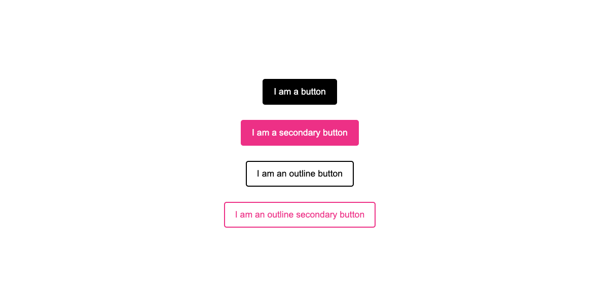
Each of these buttons have a hover state as well, you can see them on this codepen with the SASS output as CSS
By using some modern CSS we can easily create these same buttons by using custom Properties:
/* default buttons layer */
@layer buttons {
  button {
    --_color: var(--color, black);
    background: var(--_color);
    border: 2px solid var(--_color);
    color: white;
  }

  button.secondary {
    --color: deeppink;
    --hoverColor: purple;
  }
}

/* Non layered styles come last */
button.outline {
  background: transparent;
  color: var(--_color);
}

button:is(:hover, :focus) {
  --color: var(--hoverColor, DarkCyan);
}
So? What just happened here?
We started off by setting a “private” custom property for the color, which will inherit the --color custom property or fallback to black for our primary button. The secondary button will set the --color variable, so that the fallback isn't used. You also see that the secondary button sets another custom property which is the --hoverColor. This will be read by the last selector in the example which will again overwrite --color with the --hoverColor or fallback to our default button hover color which is DarkCyan.
Private custom property?
There really isn’t such a thing, it’s just a method of working and using an underscore is a way to show that we only use this custom property for this button. It’s a convention that was used when JS didn’t have const or let.
And why is this layered?
We could potentially run into some specificity problems by declaring a new button below our hover state. By declaring our buttons inside of a layer, we make sure that doesn’t happen as unlayered styles in CSS are read last.
If you want an in-depth explanation of this button system, I suggest you read about this smart button system on my blog.
This idea of private custom properties and the blueprint for this button system was also introduced to me by Lea Verou at CSS Day 2022. If you haven't seen it, it's an amazing talk where she also does a lot of fun stuff with "invalid at computed value time", which I'm not going to cover here (it's really cool, but a bit "hacky").
Creating a smart grid system
Besides buttons, we all love a good grid, right? So maybe we want to take a bit of responsive control for our gaps. Imagine the following example:
You have a little grid that is connected with some dots. On a certain breakpoint you might want to increase the gap of your grid an the connection should just grow:
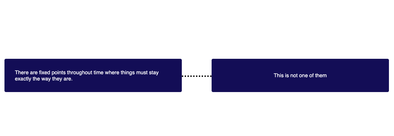
When we’re making our grid, we could set our gap with a custom property and use that same custom property to position our dotted line between the columns. The benefit? You only need to write one media query (or container query, for the cool kids) to make everything work.
Here is the basic HTML for this:
<div class="wrapper">
  <div>There are fixed points throughout time where things must stay exactly the way they are.</div>
  <div>This is not one of them</div>
</div>
And the CSS:
.wrapper {
  --gap: 30px;
  display: grid;
  grid-template-columns: repeat(auto-fit, minmax(150px, 1fr));
  gap: var(--gap);
}

@media (min-width: 800px) {
  .wrapper {
    --gap: 100px;
  }
}
.wrapper div {
  position: relative;
}

.wrapper div:not(:last-child)::after {
  position: absolute;
  inset-block-start: 50%;
  inset-inline-end: calc(var(--gap) / -1);
  inline-size: var(--gap);
  block-size: 10px;
  border-block-end: 5px dotted black;
  transform: translateY(-50%);
  content: '';
}
By adding this scoped variable --gap we can now position our pseudo element by giving it a negative inset-inline-end by using the calc() function in CSS and adjust the size as well.
Think outside the box with this inheriting
Now that we have some understanding that these custom properties can easily be overwritten, we can use this for many things when it comes to positioning elements as well. If you use them as constants for your colors, they can be overwritten to create a dark theme for your project:
:root {
  --color-lightest: rgb(250, 250, 250);
  --color-magenta: rgb(143, 45, 86);
  --color-darkest: rgb(10, 10, 10);
  --color-background: var(--color-lightest);
  --color-text: var(--color-darkest);
}

@media (prefers-color-scheme: dark) {
  :root {
    --color-magenta: rgb(72, 190, 222);
    --color-background: var(--color-darkest);
    --color-text: var(--color-lightest);
  }
}
In this example we just change the color of a background and the text based on a darkest and lightest color, which in themselves are custom properties as well.
Custom properties can contain anything you want
Yes, you read that right, anything you want! If you have a project that is working with a lot of transparent colors you could just add the number value of the rgb() function and add use your colors like this:
button {
  --background-btn: 239, 111, 108;
  background: rgb(var(--background-btn));
}
button.transparent {
  background: rgba(var(--background-btn), 0.5);
}
Although we probably won’t have the need to do this anymore for long with upcoming CSS features included in color-module-5 (for example color-mix()). Still, this could help our workflow for now.
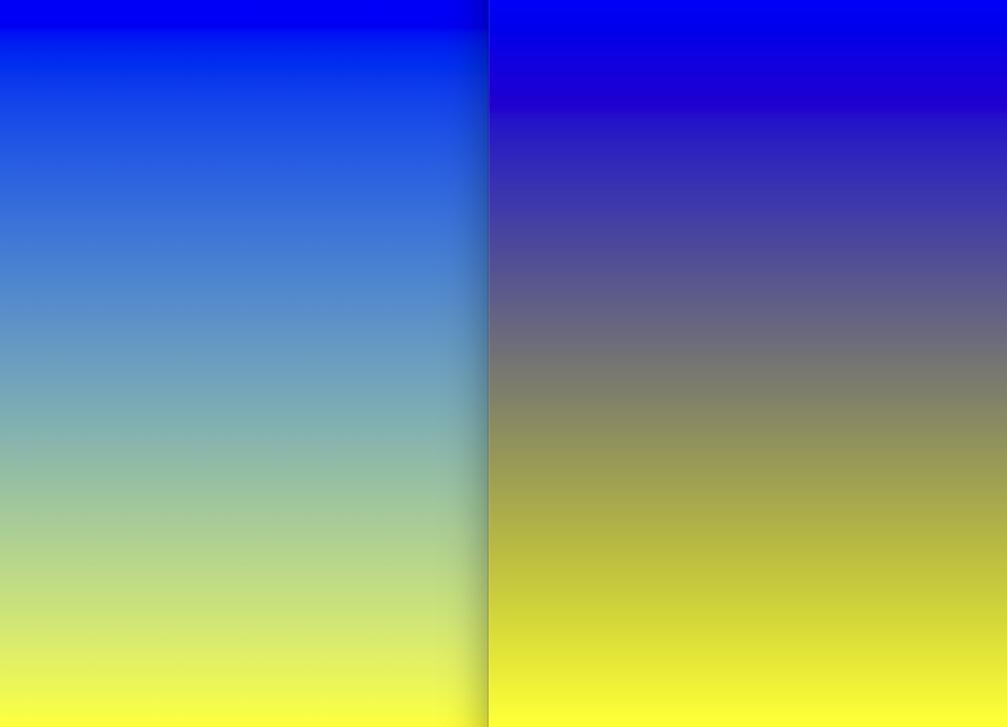
How about using custom properties for progressive enhancement
These new HD colors in CSS are really beautiful, I absolutely adore them. And there is quite a bit of browser support for them, but unfortunately we’re still stuck for the moment in providing a fallback. Checkout gradient.style if you want to play around with them.
But there is more than just using the HD colors themselves. Even using a normal gradient with sRGB color can give a completely different effect depending on the color mode you are drawing it in. The effect being that your gradient will mostly look a bit smoother and more natural. We can easily use progressive enhancement with custom properties for these kind of gradients.
Remember, custom properties can contain anything you want. So why not use a space?
:root {
  --in-oklab: ;
}

@supports (background: linear-gradient(in oklab, red, tan)) {
  :root {
    --in-oklab: in oklab;
  }
}

.gradient {
  background: linear-gradient(var(--in-oklab) rgb(0, 0, 255), rgb(255, 255, 0));
}
We can set the :root custom property to have a space, which will just show some whitespace inside of our linear-gradient. If the browser supports oklab, we can change that custom property to oklab, (notice the comma, it’s important here) That way you have a silky smooth gradient in the browsers that support it and still have a pretty good one in the others.
Checkout this codepen over different browsers to see it in action (for now, Firefox has no support)
Can you tell which is the oklab gradient?
The holy trinity: Control custom properties with JavaScript
I love the web platform and when you can create something that makes HTML, CSS and JavaScript work together in harmony, it can be a beautiful thing. Let’s start with a basic example:
Moving spotlight with custom properties
For this demo we’re going to make a little spotlight that follows your cursor, all you need is a <div>
<div id="mouse-follower"></div>
Next up we’re going to style this <div> and give it some basic styling, as well as setting it up to follow our cursor later on:
#mouse-follower {
  position: fixed;
  width: 15vw;
  height: 15vw;
  background: radial-gradient(closest-side, white 10%, transparent);
  background-repeat: no-repeat;
  transform: translate(var(--xAxis, 0), var(--yAxis, 0));
  transition: transform 0.2s ease-out;
}
The main take-away from this is the transform property, we’re setting it for both the axis with a custom property and let them fallback to 0.
Next up, we’ll use a mousemove event in Javascript and do a little calculation to set these custom properties to make the spotlight appear in the center of our cursor:
const spotlight = document.getElementById('mouse-follower')
document.addEventListener('mousemove', (event) => {
  const xAxis = event.clientX - spotlight.clientWidth / 2,
    yAxis = event.clientY - spotlight.clientHeight / 2

  spotlight.style.setProperty('--xAxis', `${xAxis}px`)
  spotlight.style.setProperty('--yAxis', `${yAxis}px`)
})
The formula to calculate the axis is pretty easy: we just use the axis from our event and subtract half the width of our spotlight itself.
Using :has() and container style queries to create booleans
Especially with the new and upcoming features such as container queries and :has(), using custom properties really seems to click. I’m currently working on a lot of demo’s that combine these exciting features and wanted to share one of them.
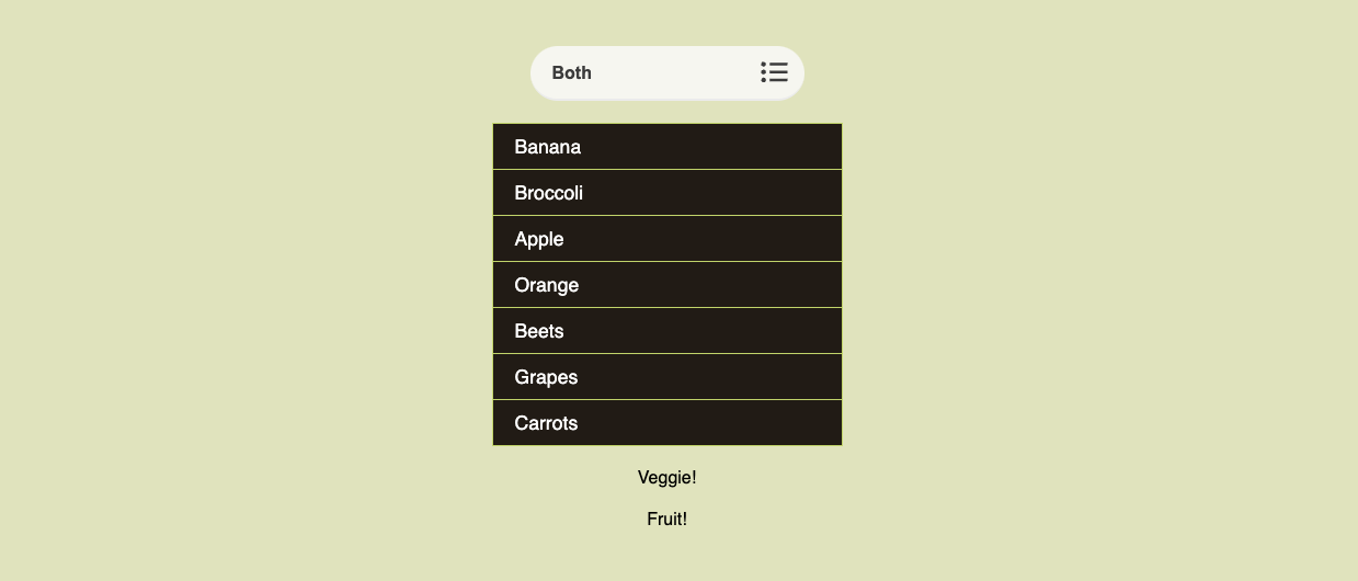
Let’s say we have the following select and list in our HTML:
<select class="select-view">
  <option value="">Both</option>
  <option value="veggie">Veggies</option>
  <option value="fruit">Fruits</option>
</select>

<ul class="list" role="list">
  <li class="fruit">Banana</li>
  <li class="veggie">Broccoli</li>
  <li class="fruit">Apple</li>
  <li class="fruit">Orange</li>
  <li class="veggie">Beets</li>
  <li class="fruit">Grapes</li>
  <li class="veggie">Carrots</li>
</ul>
When we change our select, we only want to display the items with the same class of the selected option in our select. This is by all means not the best practice to do this, but it’s nice to see something like this is possible with CSS:
:root {
  --veggies: true;
  --fruits: true;
}

:root:has(.select-view option:checked[value='veggie']) {
  --fruits: false;
}

@container style(--fruits: false) {
  .fruit {
    display: none;
  }
}

:root:has(.select-view option:checked[value='fruit']) {
  --veggies: false;
}

@container style(--veggies: false) {
  .veggie {
    display: none;
  }
}
What happens here is that we check on the :root if the current option in the select has been checked by using :has(). Following up with style queries, we can do a little check for the current value of a custom property, we’re using this trick to hide the items set to false.
We’re actually just using CSS custom properties as booleans here, pretty sweet.
For the record, I know that you could probably do this by just using :has(), But by showing it to you this way, you also get a feel of the power that container queries have to offer. This way, you could easily enhance this demo by adding more boolean dependent items such as showing a carrot or apple based on the container query, the choice is yours
But remember, this might not be the best practice, as doing a lot of heavy calculations with :has() on a :root level could affect your overall performance. So, it's ok to use it, as long as you don't overuse it.
I created a theme selector as well that uses the same technique, but might be a bit more complicated if you want to check it out. Who knows, I might write a full explainer about that one later.
What about @property?
This is probably on top of my list of "features I really wish were cross browser" (poor Firefox..). In short, it gives custom properties some superpowers. I’m not going to get into it but still wanted to show off what you can do with them by sharing a demo I created for the first iO CodePen challenge, by using @property to animate the hue of an hsl() color and rotating a conic gradient.
But don’t forget to look at some of the other pens popping up
Conclusion
Should there be a conclusion? Really? Custom properties are just awesome, they can help you to create a better, clever design system, help you in creating some of those progressive enhancements and really shorten the size of your CSS file in general, which is always a good thing. With all the new features coming to CSS from container queries to scroll-driven-animations, they will really be helpful in keeping our code clean, expandable and maintainable. So if you haven’t taken a deepdive, I can only suggest you try to do so and you will notice a whole new world of CSS opening before you.