Consistent CSS spacing is hard, but it does not have to be
Consistent CSS spacing is hard, but it does not have to be
By Niels Matthijs
7 min read
Two simple guidelines is all it takes to prevent rampant spacing issues from turning your expertly crafted project into an endless game of whack-a-mole.

- Authors

- Name
- Niels Matthijs
I've been around for a while, and it has been rewarding to witness CSS develop into a powerful styling tool. Many of the complexities we used to face are now being solved by single CSS properties (tip of the hat to box-shadow), while newly added capabilities give us powers far beyond our wildest dreams. We can whip out sub grids, container queries, and page transitions without breaking a sweat, so we can finally focus on the finer design details.
Not all of our past problems have been laid to rest though, which is what prompted me to write this article. One of the oldest and most common sets of CSS properties are still causing major headaches, and our projects suffer the consequences. Spacing is hard, and the repercussions (i.e. increased maintenance complexity and time/money spent on bugs) are grim.
Before I dig into two simple guidelines that will alleviate the most pressing spacing concerns, let's find out why CSS spacing is such a minefield.
Whack-a-mole problems
When CSS spacing goes wrong, it creates a whack-a-mole situation. For those who don't know, whack-a-mole is an old arcade game in which moles randomly rise up from holes in the ground. Players need to hit them with a hammer, doing so will cause the mole to disappear, while another one pops up in a different location.
In development terms: squashing one bug will invariably introduce a new one. The client reports an issue and the following code dive will leave a slightly confused developer pondering. He'll make a change and all will appear dandy, but unknowingly he created a new bug. When the new bug is discovered another ticket is created, resulting in increased frustration of all parties involved. And that cycle repeats itself. Ad infinitum. In other words: whack-a-mole.
There is no single reason why spacing is so vulnerable to this type of slip-up, but there are some obvious causes why we keep tripping up:
- Developers don't possess the needed design DNA to spot spacing issues.
- Spacing is everywhere, so the opportunities to mess up are plentiful.
- It's easy to mend spacing problems with crappy code, and people looking at the resulting layout will be none the wiser.
- Beware of the cascade. A trivial rule that adds 12px of vertical padding to a plain paragraph can ruin an entire project.
- There are several properties that create spacing, and a handful of context-specific hacks on top of that. Picking the right solution isn't always obvious.
- The setup of most projects is inadequate to assess layout impact, meaning developers are working in the dark (and just hoping for the best).
CSS is free-form in the sense that there are always various ways to solve a problem. No two solutions are ever truly equal though, so let's run through the most common spacing options we have at our disposal.
Using the right tool for the job
There are various ways to create space, each with its own strengths and weaknesses, but it generally comes down to these three:
- padding: creates space within an element. Works on pretty much everything, but top/bottom paddings are ineffective on inline elements.
- gap: creates consistent spacing between the direct children of an element. It only works with grid and flexbox.
- margin: creates space around elements. Works on pretty much everything, but top/bottom margins are ineffective on inline elements.
I am a big fan of gap, but its one big limitation is that it can't be overruled for specific children. It is perfect for creating a fixed grid, yet it is rigid, and changing one specific space is hacky. This severely limits its use.
Paddings are useful for creating space between an element's edge and its contents. They come in handy when an element has a clear visual definition (think backgrounds, borders, box-shadow, ...), when you want to expand the interactive area of an element (hover, click, ...), or when you want to reserve space for absolutely positioned elements.
Margin is the most versatile, and the go-to property when you need flexible space between elements. You should only switch out margin to a better-fitting property when it adds extra value. We are of course talking CSS and there will be specific use cases that require craftier solutions. As a starting point though, margin is your best bet.
Two Simple guidelines
It is very difficult to recover from a spacing setup mid-crumble, and usually, the only way out is to rework the entire deal from the ground up. So how can we shield ourselves from these types of reputation-damaging solutions? Well, if you stick to the following guidelines, you are certain to end up with far fewer problems than before.
1. A space is defined by a single CSS value
DRY and/or the single-responsibility principle, I'm not quite sure what fits best here, but the guideline should be clear enough. If you need to create space, make sure it is defined and can be changed from a single property value in your CSS. That means:
- no collapsing or adjoining margins
- no adjoining margins and paddings
- no adjoining paddings
- no borders in the same color as the background (or other, equally ugly hacks)
- ...
Just none of it. When you see this happening, stop yourself and take an extra minute to figure out a better solution (and if you can't find one, flag to your PM that the CSS needs a more profound looking at).
2. The parent controls the layout of its children
This guideline may sound a bit more abstract, but it's not that difficult to grasp. As we construct pages from reusable building blocks, our CSS needs to mimic that setup. That's why a component should never come with built-in spacing. There is no way to predict in which context a component will be used, so we really shouldn't be making any assumptions on the spacing it needs.
It's the parent element that decides the position of a component. That's the only one who knows how its children should be arranged. Layout systems like grid and flexbox allow us to do exactly that (gap goes on the parent element), if you're using margins then the child selector is your friend. And if you're using utility class-based frameworks, the burden shifts to the templating logic, which should make sure no excess spacing exists (for example by removing spacing classes on the first/last child).
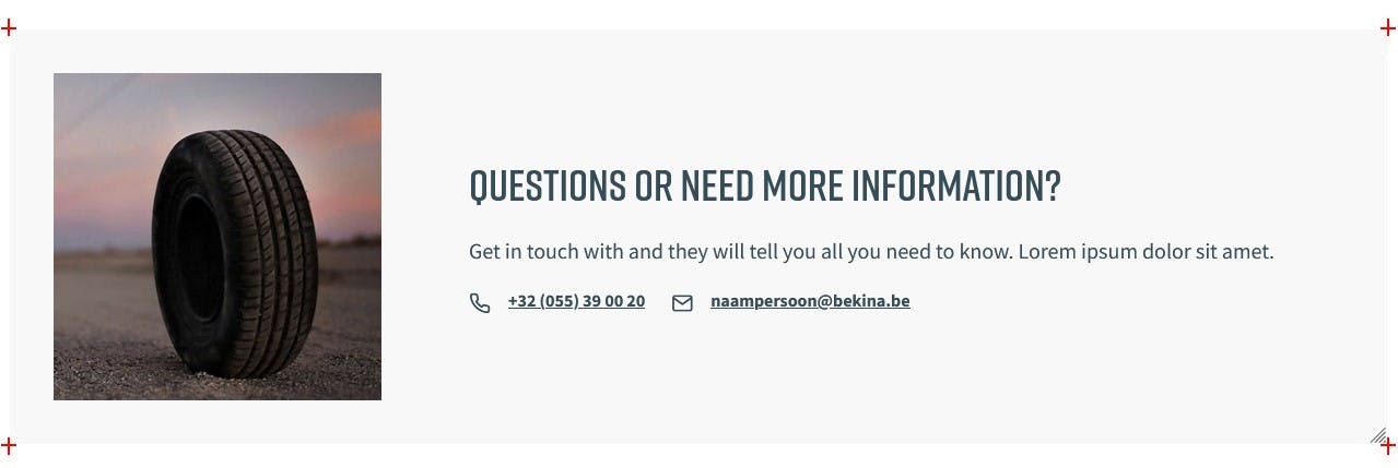
It's a simple enough guideline, but it's also an easy one to sin against, not in the least because component visualization tools (StoryBook and the like) give few indications of a component's factual boundaries. One thing that helped me tremendously was to include crop marks (the red crosses in the image below). They are relatively unobtrusive, yet a quick glance will reveal if unwanted spacing exists.
Conclusion
And that's all there is to it really. As long as you make sure that components don't bear excess spacing and that a space can be changed from a single value in the CSS, there's not a lot that can go wrong. Working with a robust component visualization tool (rather than working directly on templates) will provide extra protection against mishaps, but let's focus on prevention first.
With all the tools we have, it's a little embarrassing to have to face clients about something as basic and prevalent as spacing. There really is no excuse to have this be a problem in 2023, but all too often I come across projects that hide a convoluted layout mess, so there is clearly a need to address this. With a little care and focus, I'm sure we can make this a problem of the past.