How to build accessible main navigation?
How to build accessible main navigation?
By Tim Dujardin
6 min read
This article contains a guide to building an accessible main navigation of a website in 5 steps. The key takeaways of this guide are HTML semantics, WAI-ARIA, CSS, and JS for accessibility.
- Authors

- Name
- Tim Dujardin
Introduction
Structuring a webpage is based on using the right semantic HTML, these semantics will provide all kinds of information necessary to process the page. Most of us know that semantics make a big difference on a level of SEO, but it also has a huge impact on accessibility. People with certain disabilities use assistive technology (AT) to process all that information, so it's essential to make sure everything is communicated in the right way.
In this article, I will zoom into the main navigation region of a webpage while keeping assistive technology in mind. An example of assistive technology through computer software is a screen reader. I will be using VoiceOver, the default screen reader on Mac, to illustrate examples.
If you are interested in more examples of assistive technology take a look at the AT list on atia.org.
These are some terms I use alternatively throughout the article:
| Abbreviation | Term |
|---|---|
| a11y | Accessibility |
| AT | Assistive Technology |
| SR | Screen reader |
Screen readers
Screen readers use the accessibility tree instead of the regular DOM tree, which is basically the DOM tree from a (meaningful) semantic point of view. If you want to know how to inspect the a11y tree, you can take a look at the "What is an accessibility tree and how do I view it?" article.
Accessible in 5 steps
These are the steps I will guide you through:
- Identify the navigation region(s)
- Communicate the list of navigation items and their size
- Add multiple levels
- Highlight the active (sub)page
- Provide mobile support
1. Identify the navigation region(s)
To identify the navigation region on a webpage, I use the <nav> element.
<nav>
  <a href="/about-us">About us</a>
  <a href="/products">Products</a>
  <a href="/insights">Insights</a>
  <a href="/contact">Contact</a>
</nav>
AT info: SRs have shortcuts and gestures to navigate by landmarks, so they don't need to go through the whole webpage over and over again when discovering a website.

<header> element.2. Communicate the list of navigation items and their size
As a visual user, I see that the navigation consists of a list of 4 links, but a screen reader user won't hear a "List" announcement since the markup doesn't represent that. To create an equal experience for both users, wrap the navigation links in a <ul> element.
AT info: When SRs navigate to a list element such as
<ul>or<ol>, they will announce "List # items". The same could be achieved through using WAI-ARIA rolelistandlistitem, but the rule of thumb is "use ARIA as a last resort". More information on "When should you use ARIA?".
<nav>
  <ul>
    <li><a href="/about-us">About us</a></li>
    <li><a href="/products">Products</a></li>
    <li><a href="/insights">Insights</a></li>
    <li><a href="/contact">Contact</a></li>
  </ul>
</nav>
3. Add multiple levels
Multi-level support can be provided through 5 changes:
- Replace the
<a>with a<button>since the purpose of 'Products' is no longer navigation, but toggling the submenu. More info is in the "Buttons vs links" article. - Add
aria-expanded="false"to the<button>element to let the SR know that interacting with the button will expand another element. The visual representation is the arrow icon (<svg>) in this scenario, since it's only visual I hide it for AT througharia-hidden="true". - The element expanding through interaction with the button is referenced by the
aria-controlsattribute.
  <nav>
    <ul>
      <li><a href="/about-us">About us</a></li>
      <li>
        <button aria-expanded="false" aria-controls="products-level-2">
          Products
          <svg aria-hidden="true">...</svg>
        </button>
        <ul id="products-level-2" class="hidden">
          <li><a href="/products/product1">Product 1</a></li>
          <li><a href="/products/product2">Product 2</a></li>
        </ul>
      </li>
      <li><a href="/insights">Insights</a></li>
      <li><a href="/contact">Contact</a></li>
    </ul>
  </nav>
- Here is the first time JS comes into play: I use it to toggle the right
aria-expandedvalue and to move the focus to the first actionable element within the referenced element. - Closing the referenced element must be done via the
ESCkey, which is the industry standard for keyboard accessibility.
AT info: The SR will announce "Products, collapsed, button" on focusing the initial state of the button. When I click the button, it will announce "Products, expanded, button" and move the focus dynamically to the referenced content.
class ExpandButton {
  get isAriaExpanded() {
    return this.#isAriaExpanded;
  }

  set isAriaExpanded(value) {
    this.#isAriaExpanded = value;
    this.el.setAttribute("aria-expanded", this.isAriaExpanded.toString());

    if (this.isAriaExpanded) {
      this.#ariaControlsElement?.classList.remove(this.#hiddenClass);

      setTimeout(() => {
        // focus on first actionable element within the ref element
        this.#firstActionElement?.focus();
      }, 10);
    } else {
      this.#ariaControlsElement?.classList.add(this.#hiddenClass);
    }
  }

  initListeners() {
    // Correctly toggle aria-expanded based on click interaction
    this.clickHandler();
    // Collapse the aria-controls element when blurred
    this.collapseOnBlurHandler();
  }

  collapse() {
    this.isAriaExpanded = false;
  }

  toggle() {
    this.isAriaExpanded = !this.isAriaExpanded;
  }

  clickHandler() {
    this.el.addEventListener("mousedown", (e) => {
      e.preventDefault();
      this.toggle();
    });

    this.el.addEventListener("keydown", (e) => {
      if (e.key === "Enter" || e.key === "Space") {
        e.preventDefault();
        this.toggle();
      }
    });
  }

  collapseOnBlurHandler() {
    if (this.el.classList.contains("mobile-menu-button")) {
      return;
    }

    (this.#ariaControlsElement as HTMLElement).addEventListener(
      "focusout",
      (e: Event) => {
        const currentTarget = e.currentTarget as HTMLElement;

        requestAnimationFrame(() => {
          if (!currentTarget.contains(document.activeElement)) {
            this.collapse();
          }
        });
      }
    );
  }
}
To instantiate the ExpandButton class I have used an ExpandButtonFactory (full code example in CodePen), this factory keeps track of all the ExpandButton instances and adds a window keydown listener for the ESC key. This listener will provide the necessary collapsing mechanism when navigating by keyboard.
const menuItemButtons = ExpandButtonFactory.create(".expand-button");
4. Highlight the active (sub)page
4.1 Active page
Most websites provide an active state styling for current page links, but this will only cover the visual part of communicating this information. On a semantic level, I need to make use of an ARIA attribute called aria-current.
AT info: The anchor element with attribute
aria-current="page"will be announced as "Current page, link, About us" by the VoiceOver screen reader.
  <nav>
    <ul>
      <li><a href="/about-us" aria-current="page">About us</a></li>
      <li>
        <button aria-expanded="false" aria-controls="products-level-2">
          Products
          <svg aria-hidden="true">...</svg>
        </button>
        <ul id="products-level-2" class="hidden">
          <li><a href="/products/product1">Product 1</a></li>
          <li><a href="/products/product2">Product 2</a></li>
        </ul>
      </li>
      <li><a href="/insights">Insights</a></li>
      <li><a href="/contact">Contact</a></li>
    </ul>
  </nav>
4.2 Active subpage
When the webpage contains multi-level main navigation, I can use the title attribute on the parent link to announce that a sublevel item is the current page.
AT info: Now, when I navigate to the 'Products' link via my screen reader, I will hear "Products, link, Contains current page link" to indicate that the current page is inside its submenu.
  <nav>
    <ul>
      <li><a href="/about-us">About us</a></li>
      <li>
        <button aria-expanded="true" aria-controls="products-level-2" title="Contains current page link">
          Products
          <svg aria-hidden="true">...</svg>
        </button>
        <ul id="products-level-2">
          <li><a href="/products/product1" aria-current="page">Product 1</a></li>
          <li><a href="/products/product2">Product 2</a></li>
        </ul>
      </li>
      <li><a href="/insights">Insights</a></li>
      <li><a href="/contact">Contact</a></li>
    </ul>
  </nav>
Important: Be careful with the usage of the
titlethough, more info in the "Title attribute use and abuse" article.
5. Provide mobile support
The mobile navigation has a mobile menu button to trigger the <nav>, so I used the same approach as with the multi-level navigation in step 3.
<header>
  <button
    class="mobile-menu-button" aria-expanded="false" aria-controls="main-nav">Mobile menu</button>
  <nav id="main-nav" class="hidden-mobile">...</nav>
</header>
The easy part of using the ExpandButton class is that I can reuse it for the mobile menu button which triggers the visibility of the mobile navigation.
const mobileMenuButton = ExpandButtonFactory.create(
  ".mobile-menu-button",
  "hidden-mobile"
);
The final touch
The nice thing about using aria attributes is that I don't need the extra is-active classes to provide some styling. Just by targeting [aria-expanded] I have a selector that provides me with the necessary information.
Same for [aria-current="page"] and [aria-current="true"] to style active navigation menu items when they respectively are or contain the current page link.
...
button {
  &[aria-expanded="true"] > svg {
    transform: rotate(180deg);
  }

  &[aria-expanded="false"] + ul {
    opacity: 0;
    height: 0;
  }
}
...
CodePen
Finally, I add some styling to make it look more like the usual website navigation. The full code example is available on CodePen: Accessible main navigation.
Tips and tricks
Handling multiple <nav>
If the webpage contains multiple <nav> elements, each <nav> needs an aria-label element to provide screen reader users with clear distinction.
AT info: SRs will list the following 2 landmarks respectively as "Main navigation" and "Product navigation", instead of 2 times "navigation".
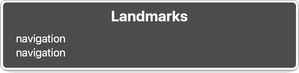
The default list of navigation landmarks identified by VoiceOver.
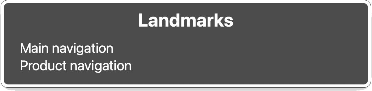
List of navigation landmarks identified by VoiceOver that contain an additional aria-label attribute.
// Main navigation
<nav aria-label="Main">
  <ul>
    <li><a href="/about-us">About us</a></li>
    <li><a href="/products" aria-current="page">Products</a></li>
    <li><a href="/insights">Insights</a></li>
    <li><a href="/contact">Contact</a></li>
  </ul>
</nav>

// Product navigation
<nav aria-label="Product">
  <ul>
    <li><a href="/product1">Product 1</a></li>
    <li><a href="/product2">Product 2</a></li>
    <li><a href="/product3">Product 3</a></li>
    <li><a href="/product4">Product 4</a></li>
  </ul>
</nav>