Are our links visually accessible?
Are our links visually accessible?
By Frank van Eldijk-Smeding
3 min read
A simple link inside a paragraph, what could go wrong? Well, a lot in fact. Let’s have a closer look, shall we?
- Authors

When I wrote about the accessibility of links, I’ve focused on screen reader & voice recognition users. But this time I’ll focus on what visually goes wrong for our links.
So, let’s get started and figure out what those barriers are and what we can do to prevent them from happening.
A simple link inside a paragraph, what could go wrong?
While browsing the web, I keep noticing a design trend more often than before. And that’s the styling of their links.
Having only a color difference to separate them from the rest of the content. You might wonder what’s wrong with only using a color to convey meaning, so let’s find out together.
Lost in a sea of text
I’ll show you two examples, both showing two paragraphs and a link somewhere in the middle.
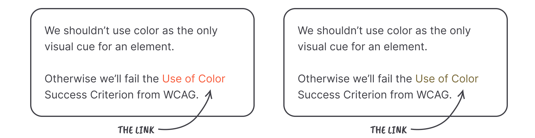
The first example is what people without a color vision deficiency (better known as color blindness) see. And with the second example I’ve simulated a type of color vision deficiency called Protanopia.
Do note that the simulated effect might differ from reality. This is due to a lot of factors (e.g. the algorithm used, severity of the color vision deficiency, monitor settings, etc).
Are you able to spot the link in the second example? I bet it wasn’t as easy as the first example. So, what could we do to prevent this from happening?
More weight please
So, what about giving our links more font-weight? Surely that will solve the problem, right?
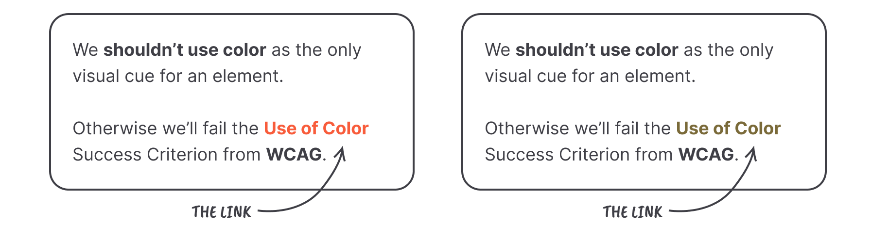
Not ideal I’m afraid. Even though the link stands out more compared to the rest of the content. We’ve introduced a new problem. It’s still unclear which is just bolded text and which is the link.
Underline to the rescue
What our links — or rather our users — need, is an underline. It’s still often removed (and I’ve been guilty of this in the past as well) because of aesthetic reasons.
Yet, it’s the best visual cue for a link that’s available. And most likely, it’s what our users will expect. So, let's add some underlines shall we.

In both examples the link stands out, even with a loss of color.
Conclusion
- When we’re developing (or designing) for our users, we shouldn’t use color as the only visual cue
- Using underlines for our links is what our users will expect the most, don’t make them think or second guess!
Further reading
- https://www.w3.org/TR/WCAG21/#use-of-color
- https://www.w3.org/WAI/WCAG21/Techniques/failures/F73
- https://www.w3.org/WAI/WCAG21/Techniques/general/G183